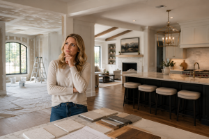
Choosing the right paint color is one of the most impactful design decisions homeowners can make. While flooring, cabinetry, lighting, and furniture certainly contribute to the overall appearance of a home, color has a unique ability to influence how a space feels. The right shade can make a room appear larger, brighter, warmer, more inviting, or even more luxurious.
In Texas, selecting paint colors requires a slightly different approach than in other parts of the country. Homes throughout Huntsville, The Woodlands, Conroe, Montgomery, and surrounding communities often benefit from abundant natural light, open floor plans, tall ceilings, and indoor-outdoor living spaces. Colors that feel balanced and sophisticated in a northern climate can sometimes feel cold, flat, or overly sterile under the bright Texas sun.
The most successful interiors are not necessarily built around trends. They’re designed around how people want to feel when they walk through the door. Whether you’re creating a modern custom home, updating a traditional residence, or preparing a property for resale, the right paint color can elevate every room and create a cohesive design throughout the entire home.
Below are ten of the best paint colors for Texas homes that consistently perform beautifully in Texas homes and continue to be favorites among designers, builders, and homeowners alike.
What Makes a Paint Color Work Well in Texas Homes?
Before choosing a color, it’s important to understand how natural light affects interior design.
Texas homes typically receive strong sunlight throughout much of the year. This increased exposure can dramatically change how a paint color appears on the wall. Shades that seem soft and neutral on a paint sample may appear significantly brighter once applied throughout an entire room.
Architectural style also plays an important role. Modern farmhouses, transitional homes, luxury custom residences, ranch-style properties, and contemporary builds each respond differently to various color palettes.
The best paint colors for Texas homes tend to share a few common characteristics. They complement natural light, work well across multiple rooms, create visual warmth without feeling heavy, and remain timeless rather than trend-driven. The goal is to create a home that feels elegant today while still looking beautiful years from now.
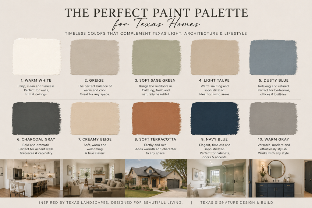
10 Paint Colors Texas Homeowners Love
1. Warm White
Warm white continues to be one of the most versatile and sophisticated color choices available. Unlike stark bright whites that can sometimes feel clinical, warm whites create a welcoming atmosphere while maintaining a clean and modern appearance.
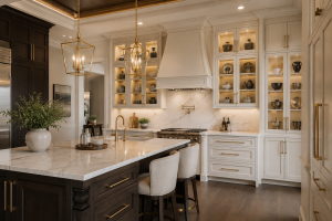
This color works exceptionally well in kitchens, living rooms, dining areas, and open-concept floor plans where homeowners want spaces to feel bright without appearing cold. Warm white reflects natural light beautifully and serves as an ideal backdrop for wood finishes, stone surfaces, custom cabinetry, and statement lighting.
Homeowners who appreciate modern farmhouse, transitional, or luxury contemporary interiors often gravitate toward this timeless shade.
2. Greige
Greige, a blend of gray and beige, has become one of the most popular neutral colors in residential design. It combines the sophistication of gray with the warmth of beige, creating a balanced tone that works in almost any room.
One reason designers frequently recommend greige is its adaptability. It complements a wide range of flooring materials, furniture styles, and decorative finishes without overpowering the space.
For homeowners seeking a safe yet elevated color choice that appeals to both personal enjoyment and future resale value, greige remains one of the strongest options available.
3. Soft Sage Green
Soft sage green has gained significant popularity in recent years because of its calming and organic qualities. Inspired by nature, this color creates a sense of relaxation that many homeowners find especially appealing in bedrooms and bathrooms.
Unlike bolder shades of green, sage feels subtle and sophisticated. It pairs beautifully with natural wood tones, white cabinetry, brushed brass fixtures, and stone accents.
For homeowners looking to create a spa-like atmosphere, few colors deliver the same level of tranquility and timeless appeal.
4. Light Taupe
Light taupe offers a refined alternative to traditional beige. It provides warmth and depth without overwhelming a room, making it particularly effective in living spaces where comfort and elegance are equally important.
This color works exceptionally well in homes with traditional, transitional, or European-inspired architecture. It creates a rich backdrop that enhances furniture, artwork, and decorative details while maintaining a soft, inviting atmosphere.
Many designers consider light taupe one of the safest luxury neutrals because it rarely feels trendy or outdated.
5. Dusty Blue
Dusty blue introduces personality without sacrificing sophistication. This muted shade creates visual interest while maintaining a calming presence that works beautifully in bedrooms, home offices, and guest suites.
Blue is often associated with focus, confidence, and relaxation, making it a natural choice for spaces intended to promote productivity or rest.
When paired with warm woods, soft textiles, and neutral furnishings, dusty blue creates a balanced environment that feels both comfortable and refined.
6. Charcoal Gray
While many homeowners focus on light neutrals, charcoal gray can be an incredibly powerful design tool when used strategically.
Rather than painting an entire room, designers often use charcoal gray as an accent color on fireplaces, built-in cabinetry, feature walls, or architectural details. The contrast it creates can add drama, depth, and sophistication to a space without making it feel dark.
In luxury homes, charcoal gray is frequently used to highlight custom millwork and create focal points that draw attention to the home’s architectural features.
7. Creamy Beige
Creamy beige continues to be a favorite among homeowners who want warmth without committing to stronger earth tones.
This color creates a comfortable and welcoming atmosphere that works especially well in family homes. It complements a variety of furniture styles and helps tie together spaces that feature natural stone, hardwood flooring, and warm wood cabinetry.
For homeowners seeking a timeless palette that feels approachable and inviting, creamy beige remains a dependable choice.
8. Soft Terracotta
Inspired by natural clay and desert landscapes, soft terracotta brings warmth, character, and a subtle connection to the natural beauty often associated with Texas architecture.
Used thoughtfully, this color can create remarkable depth in dining rooms, powder bathrooms, entryways, and outdoor living spaces. It pairs exceptionally well with organic materials and can help create interiors that feel both sophisticated and grounded.
For homeowners looking to move beyond traditional neutrals, soft terracotta offers an elegant way to introduce warmth and personality.
9. Navy Blue
Navy blue remains one of the most versatile accent colors in luxury residential design.
Whether used on custom cabinetry, built-ins, office walls, or statement features, navy creates a sense of richness and sophistication that few colors can match. It works particularly well when paired with white trim, brass hardware, natural wood accents, and high-end lighting fixtures.
Homeowners who appreciate classic design often choose navy because it feels bold without being trendy.
10. Warm Gray
Warm gray has become a modern classic. Unlike cooler grays that can sometimes feel sterile, warm gray offers subtle depth while maintaining a clean and contemporary appearance.
Its versatility makes it suitable for nearly every room in the home, from living areas and kitchens to bedrooms and hallways. Warm gray also provides an excellent foundation for evolving design styles, allowing homeowners to update furnishings and décor over time without needing to repaint.
For those seeking flexibility and long-term value, warm gray remains one of the smartest choices available.
How to Choose the Right Paint Color for Your Home
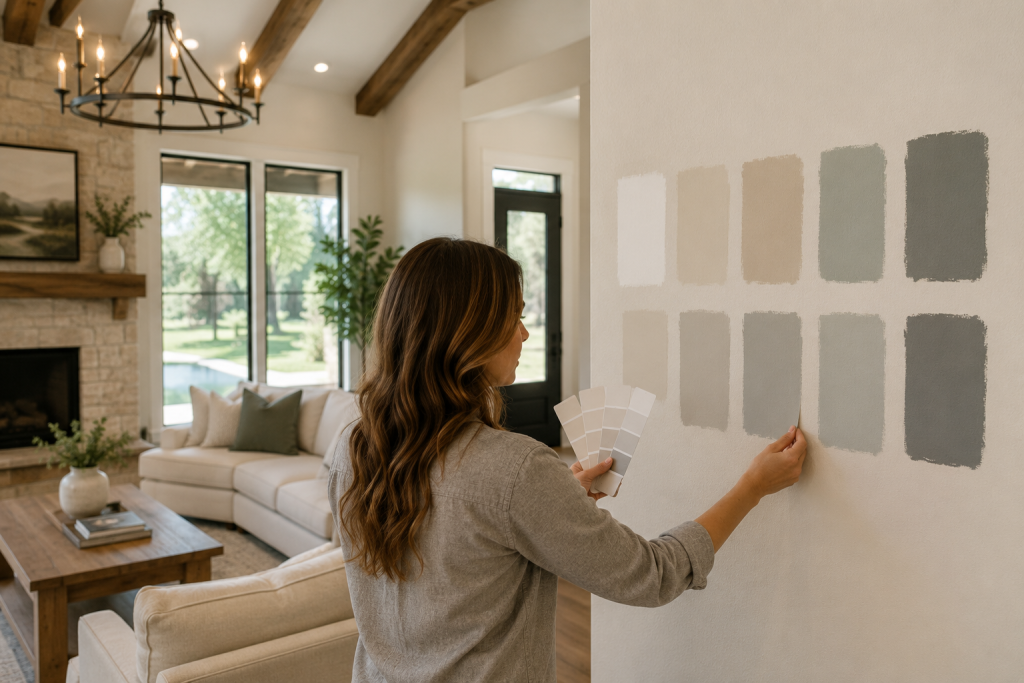
The best paint color isn’t always the one that’s trending online or featured in a magazine. The right choice depends on your home’s architecture, lighting conditions, furniture, finishes, and the atmosphere you want to create.
Before making a final decision, it’s worth testing several samples directly on the wall and observing how they change throughout the day. Morning sunlight, afternoon brightness, and evening lighting can all dramatically alter the appearance of a color.
The most successful homes are designed holistically, with colors working together to create a consistent experience from room to room rather than treating each space as an isolated design decision.
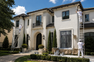
Why Professional Painting Makes a Difference
Even the perfect color can fall short if the application isn’t executed properly.
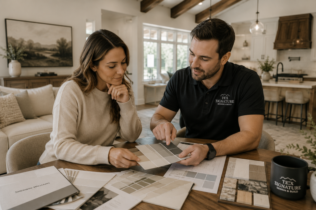
Professional painting involves much more than applying paint to a wall. Surface preparation, repairs, primer selection, finish choices, and application techniques all contribute to the final result. Proper preparation helps ensure durability, consistency, and a finish that enhances the overall design of the home.
At Tex Signature, our team helps homeowners select colors that complement their architecture, lighting, and design goals while delivering high-quality finishes that stand the test of time.
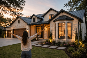
Ready to Refresh Your Home?
Whether you’re updating a single room or planning a complete interior transformation, choosing the right paint colors can dramatically improve the look and feel of your home.
Contact Tex Signature today to discuss your project and discover how professional color selection and expert painting services can help bring your vision to life.